//
TremorTek
//
TremorTek

Company:
Company:
Snap Pea Design
Snap Pea Design
Role:
Role:
Interaction Design Lead
Interaction Design Lead
Year:
Year:
2020
2020
Duration:
Duration:
8 Months
8 Months
Overview
TremorTek® devices are used to measure tremor and dystonia, helping physicians make more informed clinical decisions and track changes in symptoms over time. Movement disorders and age-related mobility issues are major challenges for physicians. Rather than starting from scratch, TremorTek focuses on improving existing care pathways to help doctors advance in digital healthcare.
TremorTek® devices are used to measure tremor and dystonia, helping physicians make more informed clinical decisions and track changes in symptoms over time. Movement disorders and age-related mobility issues are major challenges for physicians. Rather than starting from scratch, TremorTek focuses on improving existing care pathways to help doctors advance in digital healthcare.
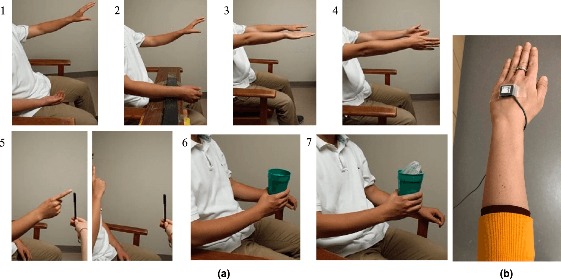
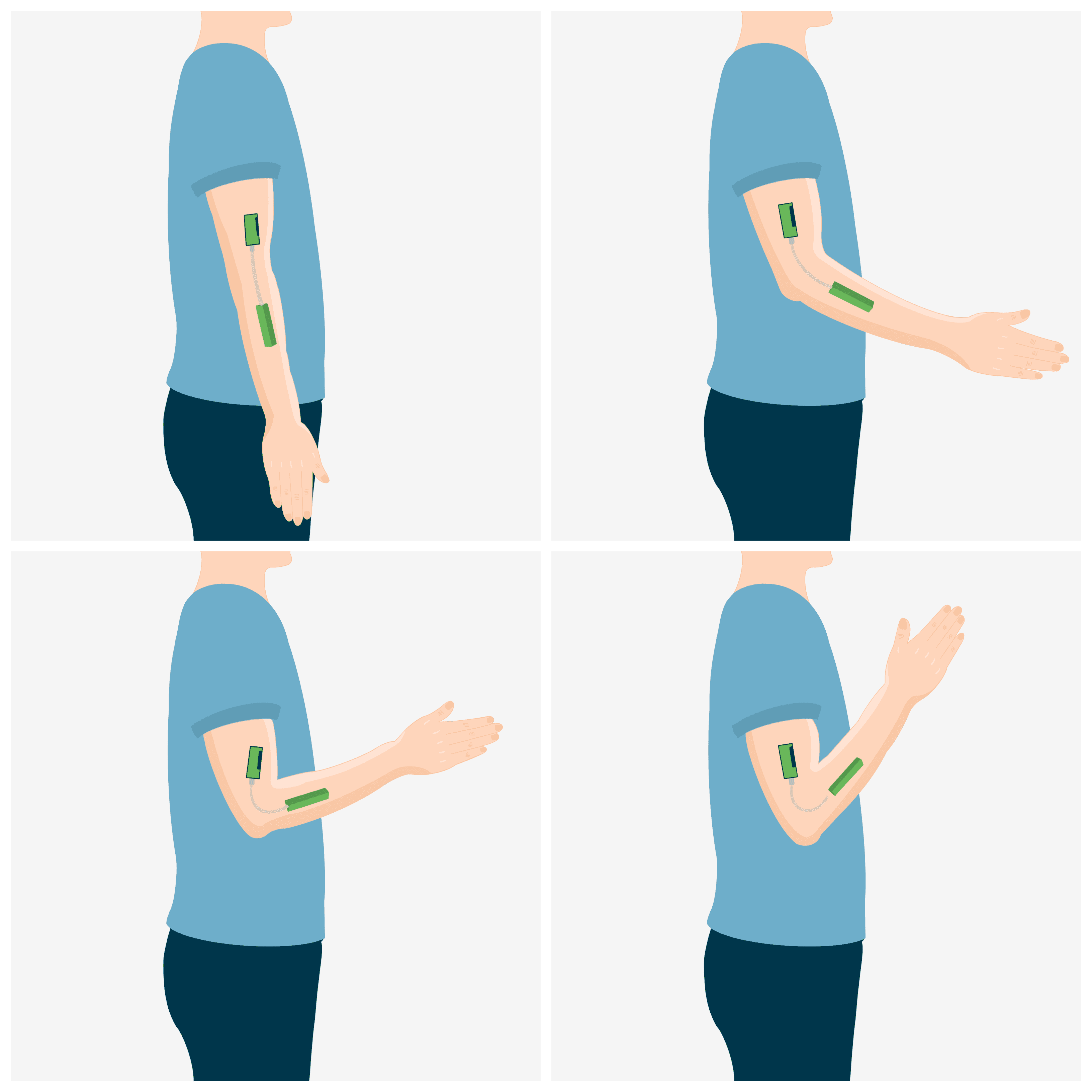
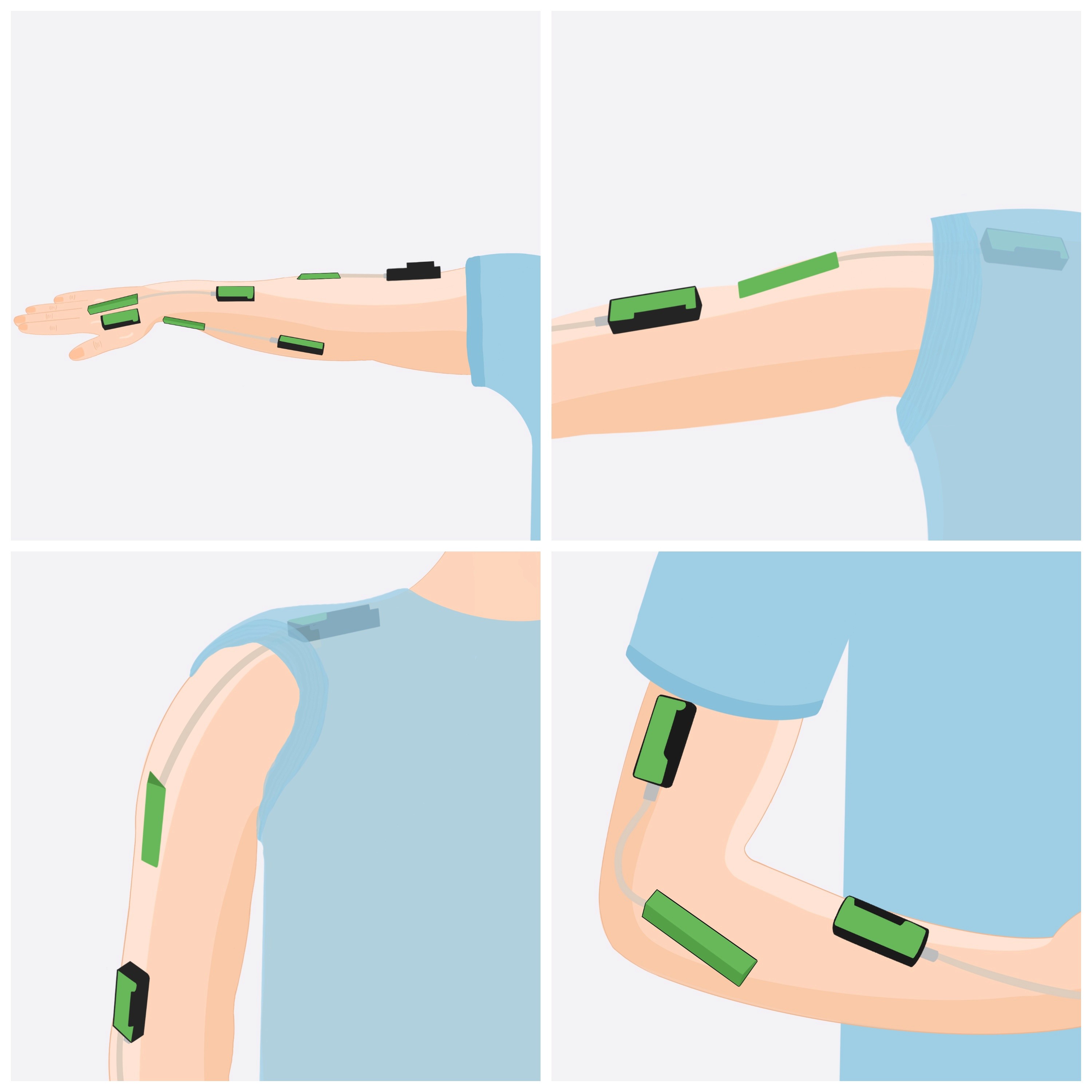
Reference: TremorTek® device placement examples
Problem
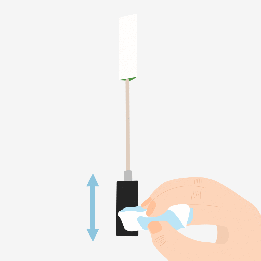
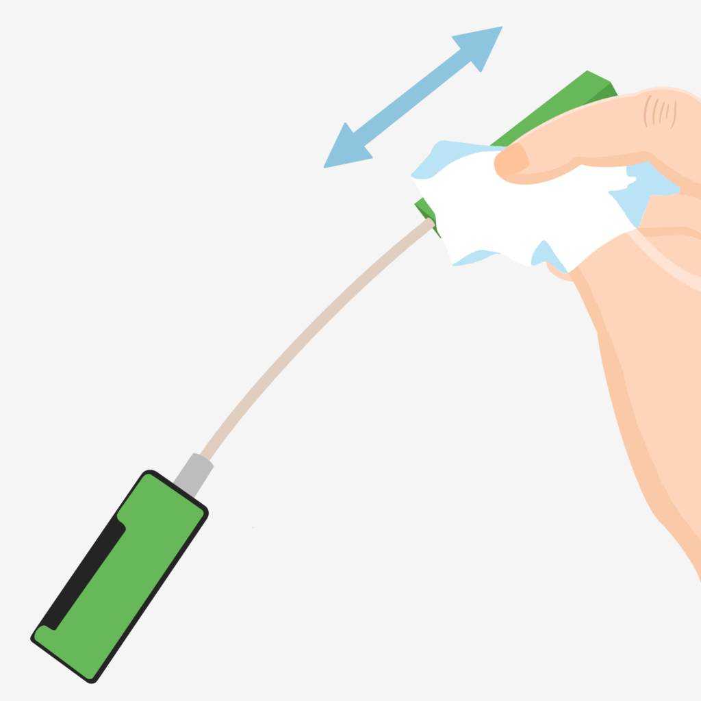
I was tasked with creating an easy-to-follow illustrations for a patient handbook to guide patients monitor physical motion, and limb positioning using their TremorTek® device at home.
I was tasked with creating an easy-to-follow illustrations for a patient handbook to guide patients monitor physical motion, and limb positioning using their TremorTek® device at home.
Solution
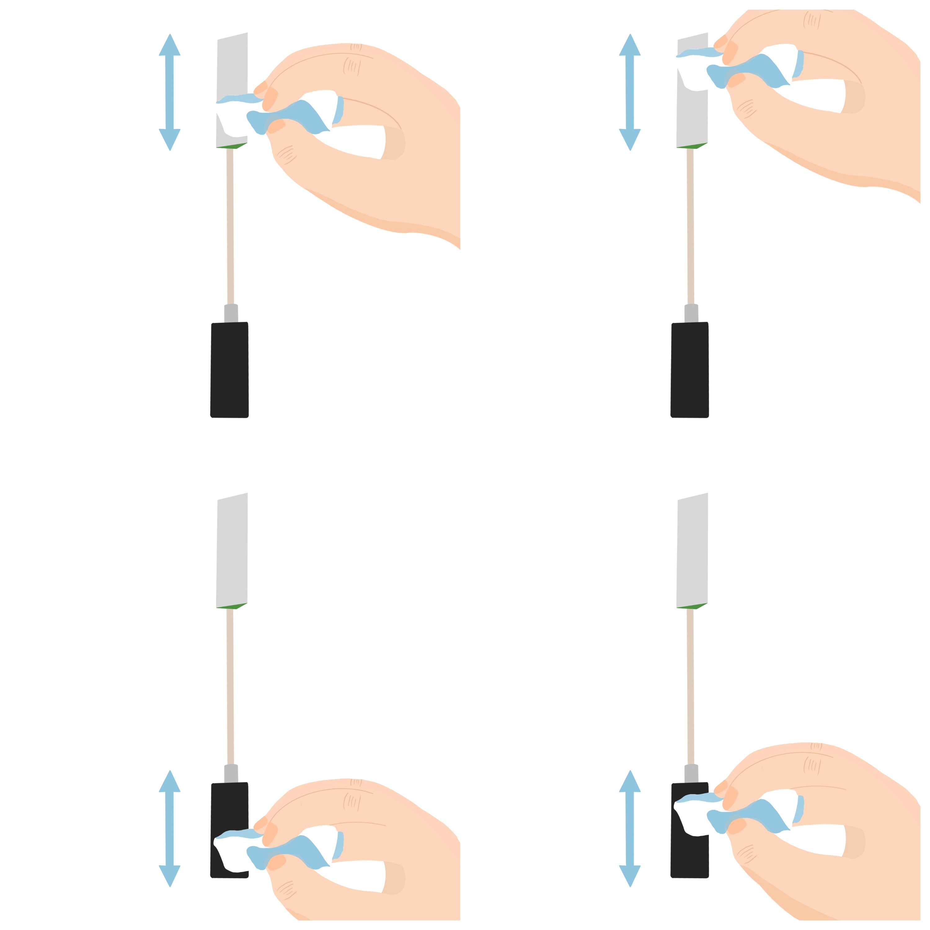
Design a clear, step-by-step illustrations to guide patients on how to correctly place their sensors during pilot testing for TremorTek® devices are used to measure tremor and dystonia. This will help physicians make more informed clinical decisions and track changes in symptoms over time.
Design a clear, step-by-step illustrations to guide patients on how to correctly place their sensors during pilot testing for TremorTek® devices are used to measure tremor and dystonia. This will help physicians make more informed clinical decisions and track changes in symptoms over time.
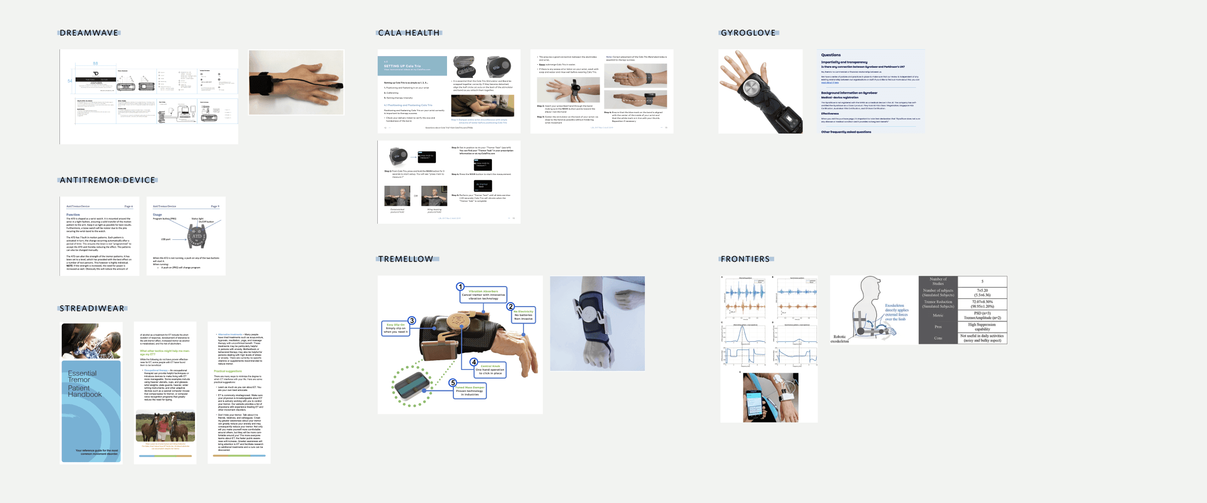
Reference: Competitive Market Analysis
Opportunity
Currently, the market for tremor and dystonia monitoring devices has been focused more on the devices themselves rather than comprehensive, user-friendly manuals. While some companies do provide instructions for use, they are often text-heavy and not always designed with the patient experience in mind. This gap in the market presents a significant opportunity.
Currently, the market for tremor and dystonia monitoring devices has been focused more on the devices themselves rather than comprehensive, user-friendly manuals. While some companies do provide instructions for use, they are often text-heavy and not always designed with the patient experience in mind. This gap in the market presents a significant opportunity.
Defining Success
In comparison to more established digital health fields (like diabetes or heart disease monitoring), tremor and dystonia device manufacturers are still catching up in terms of offering highly polished, visually-oriented patient guides. While there are instructional resources available, they are often not tailored to the diverse needs of patients—especially those with neurological conditions.
In comparison to more established digital health fields (like diabetes or heart disease monitoring), tremor and dystonia device manufacturers are still catching up in terms of offering highly polished, visually-oriented patient guides. While there are instructional resources available, they are often not tailored to the diverse needs of patients—especially those with neurological conditions.
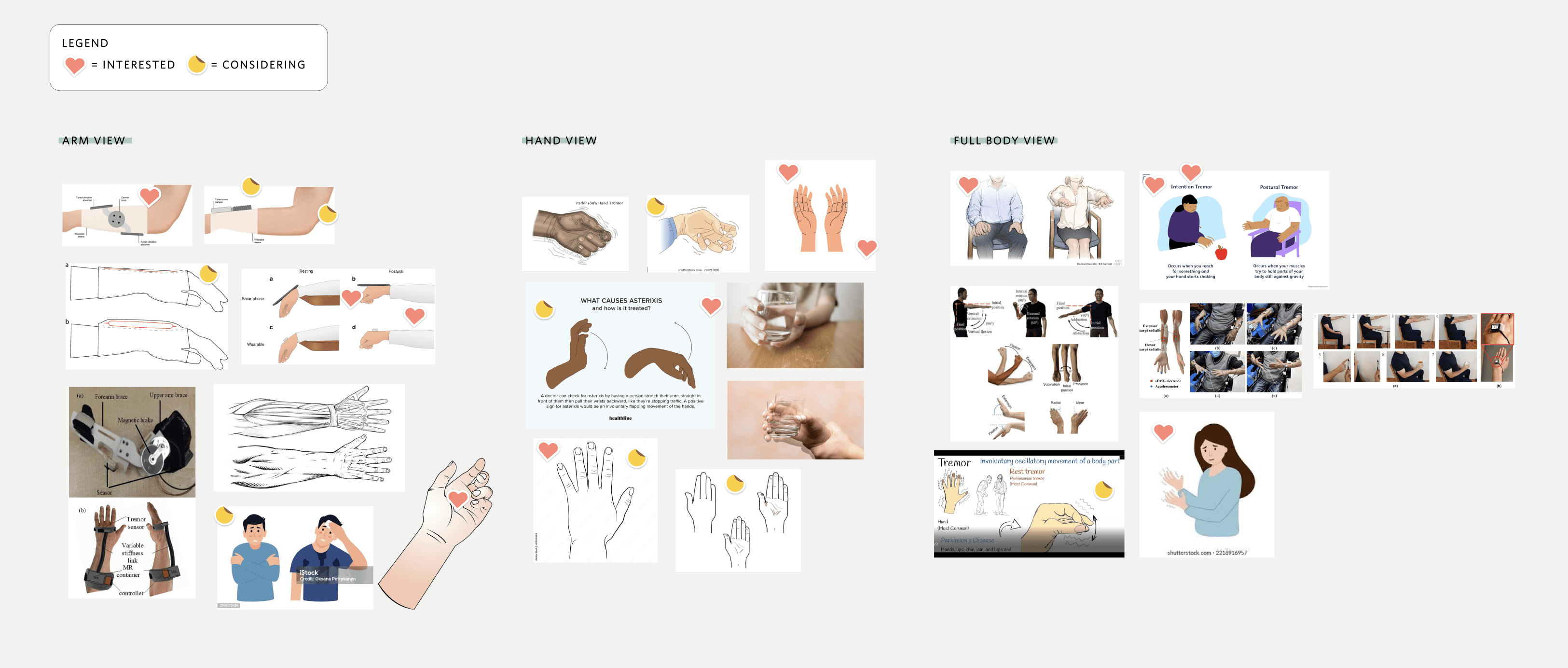
Reference: Reviewing Concepts with Stakeholder & Design Team = Decision Point
Brainstorming Sessions
I explored several illustrative styles for TremorTek’s handbook, and the bright, simple visuals we landed on are key to making everything as clear and easy to follow as possible. By keeping things straightforward, we’re cutting through any potential confusion and making sure patients can quickly understand how to apply the device—no complicated jargon or overwhelming instructions needed.
I explored several illustrative styles for TremorTek’s handbook, and the bright, simple visuals we landed on are key to making everything as clear and easy to follow as possible. By keeping things straightforward, we’re cutting through any potential confusion and making sure patients can quickly understand how to apply the device—no complicated jargon or overwhelming instructions needed.
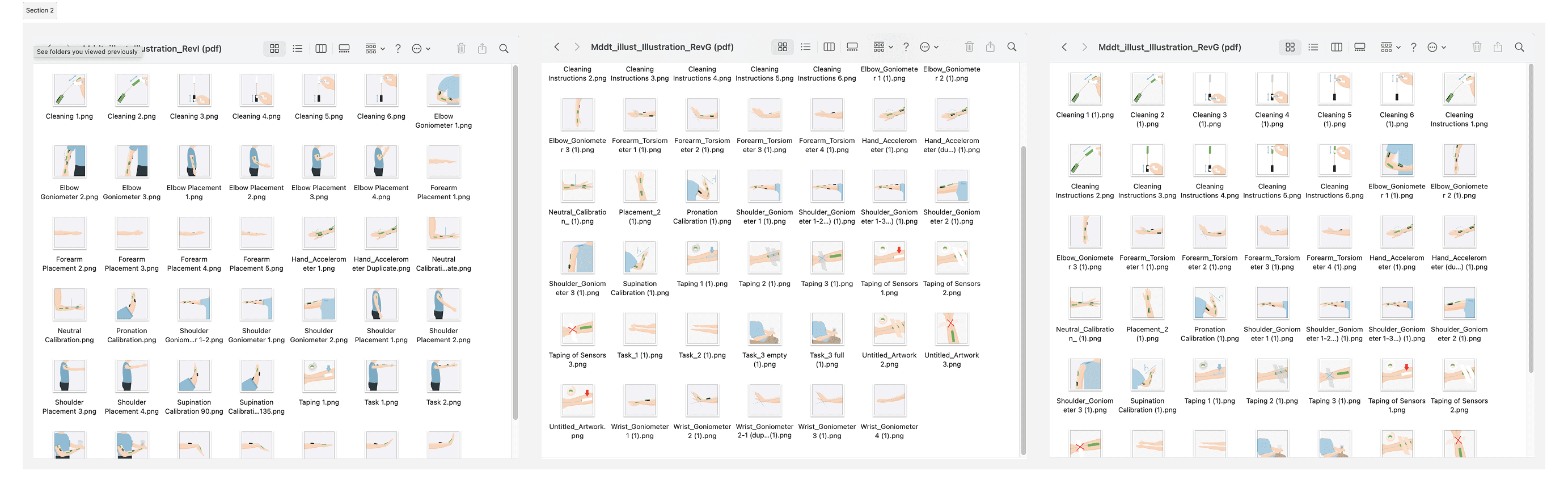
Reference: Extensive reviews/feedback/iterations


Updated key screens
Initial Launch Results
During pilot testing, user research showed a 40% increase in correct sensor placement and a 30% drop in errors when patients used the new handbook with my illustrations.
The simple, bright visuals made it easier for patients to follow, resulting in better accuracy and a smoother overall experience.
During pilot testing, user research showed a 40% increase in correct sensor placement and a 30% drop in errors when patients used the new handbook with my illustrations.
The simple, bright visuals made it easier for patients to follow, resulting in better accuracy and a smoother overall experience.
All Work
UI/UX
Illustrations
Offline


All Work
UI/UX
Illustrations
Offline

Let’s Connect
Let’s
Connect