//
Digital Client Onboarding
//
Digital Client Onboarding
Company:
Company:
CIBC
CIBC
Role:
Role:
Product Design Lead
Product Design Lead
Year:
Year:
2022-2023
2022-2023
Duration:
Duration:
14 Months
14 Months
Overview
CIBC’s Digital Client Onboarding (DCO) is designed to simplify banking and provide a seamless experience for clients with new deposit or credit card products. As digital experiences become more embedded in everyday life, it has shifted user preferences and expectations. There are increasing expectations around a delivering both a digital and omni-channel experience that is hyper-personalized, convenient and needs-focused.
CIBC’s Digital Client Onboarding (DCO) is designed to simplify banking and provide a seamless experience for clients with new deposit or credit card products. As digital experiences become more embedded in everyday life, it has shifted user preferences and expectations. There are increasing expectations around a delivering both a digital and omni-channel experience that is hyper-personalized, convenient and needs-focused.
Problem
CIBC faced the challenge of helping clients not only activate their cards but also set up the rest of their accounts in an intuitive and engaging way.
The existing platforms struggled with an outdated visual design, too many unorganized tasks, and inconsistent page layouts. They also failed to highlight the benefits of completing tasks or offer meaningful personalization, leaving users overwhelmed and disengaged.
Solution
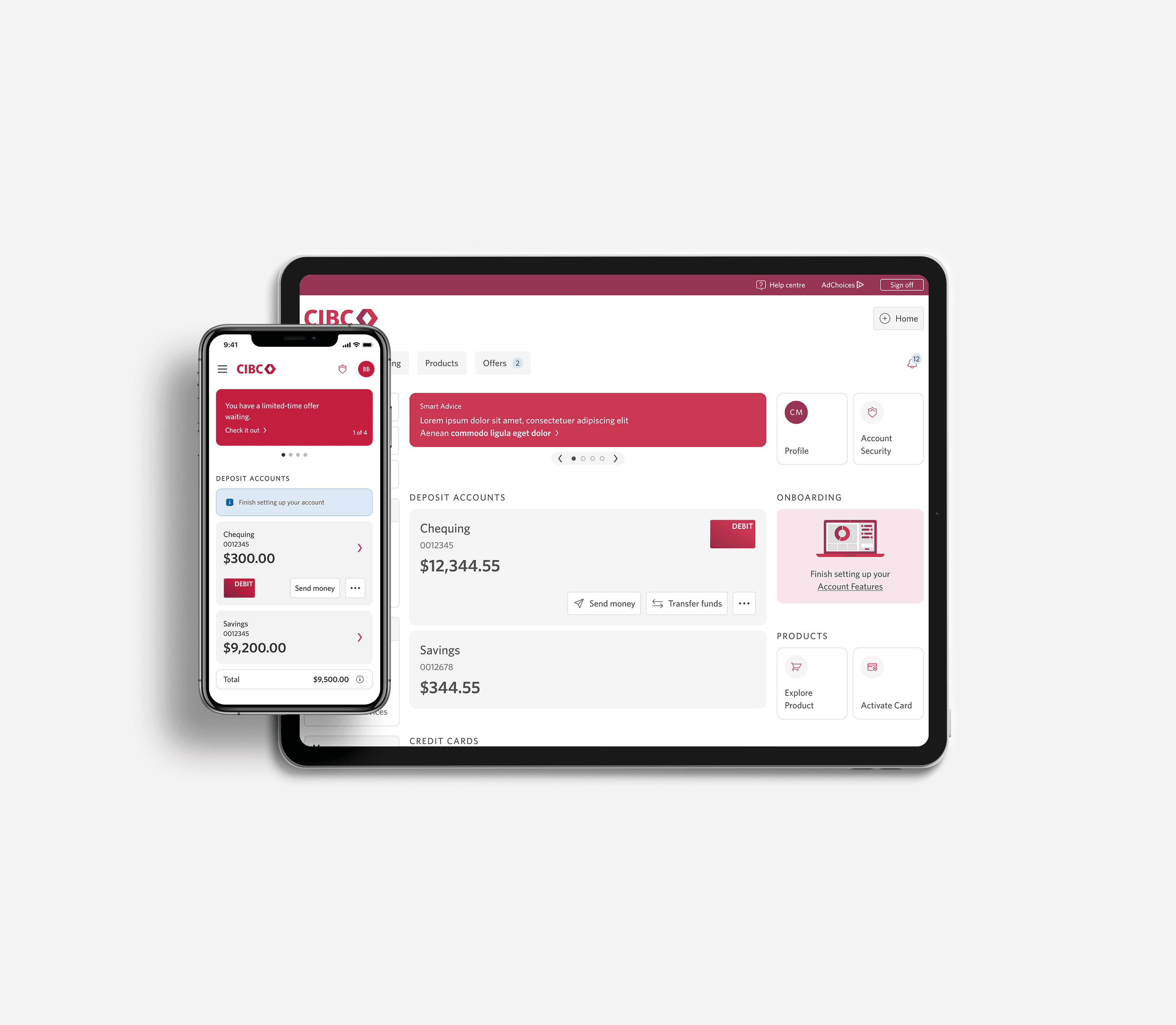
To solve this, I designed a user-centric experience that prioritizes transparency giving valuable notices, easy navigation, and seamless interaction. The app leverages smart algorithms to recommend content based on user preferences, fostering genuine connections. A clean, modern interface ensures a smooth experience, while interactive features encourage users to engage and stay connected, solving the initial problem of relevance and usability.
To solve this, I designed a user-centric experience that prioritizes transparency giving valuable notices, easy navigation, and seamless interaction. The app leverages smart algorithms to recommend content based on user preferences, fostering genuine connections. A clean, modern interface ensures a smooth experience, while interactive features encourage users to engage and stay connected, solving the initial problem of relevance and usability.


Defining success
The aim of this initiative is to help complete the client's account set up process. The business's objective is to surface key capabilities that drive more engagement through churn rate.
The aim of this initiative is to help complete the client's account set up process. The business's objective is to surface key capabilities that drive more engagement through churn rate.
Opportunity
In MVP1, we saw a 14% drop-off after users activated their card, often choosing "remind me later" to skip the next steps.
In MVP2, I led onboarding improvements by collaborating with UX research and strategy to identify key pain points:
Outdated visuals: The interface felt disconnected from the rest of CIBC’s ecosystem, making the flow feel like an afterthought rather than a valuable part of the client journey.
Inconsistent Pages and Flow Continuity: Once clients activated their card on their first step in the flow, they were immediately presented with a “Remind Me Later” option. This was encouraging for clients to abandon the flow - There was no clear momentum or guidance to carry them forward.
Lack of Value Messaging: Each page looked and felt slightly different, which created friction and confusion. We weren’t clearly communicating the benefits of moving forward—whether it was faster access to features, improved security, or unlocking full product potential.
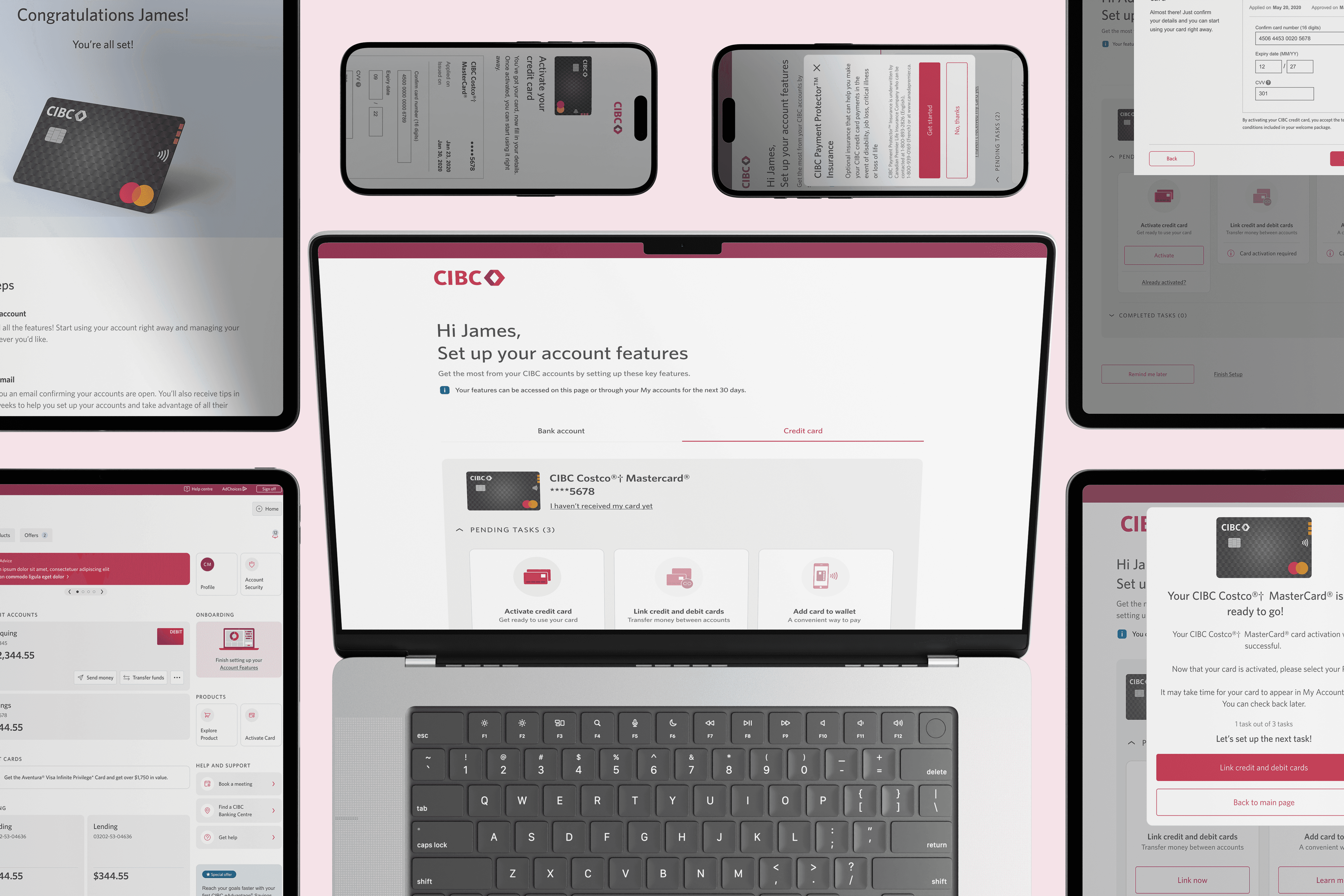
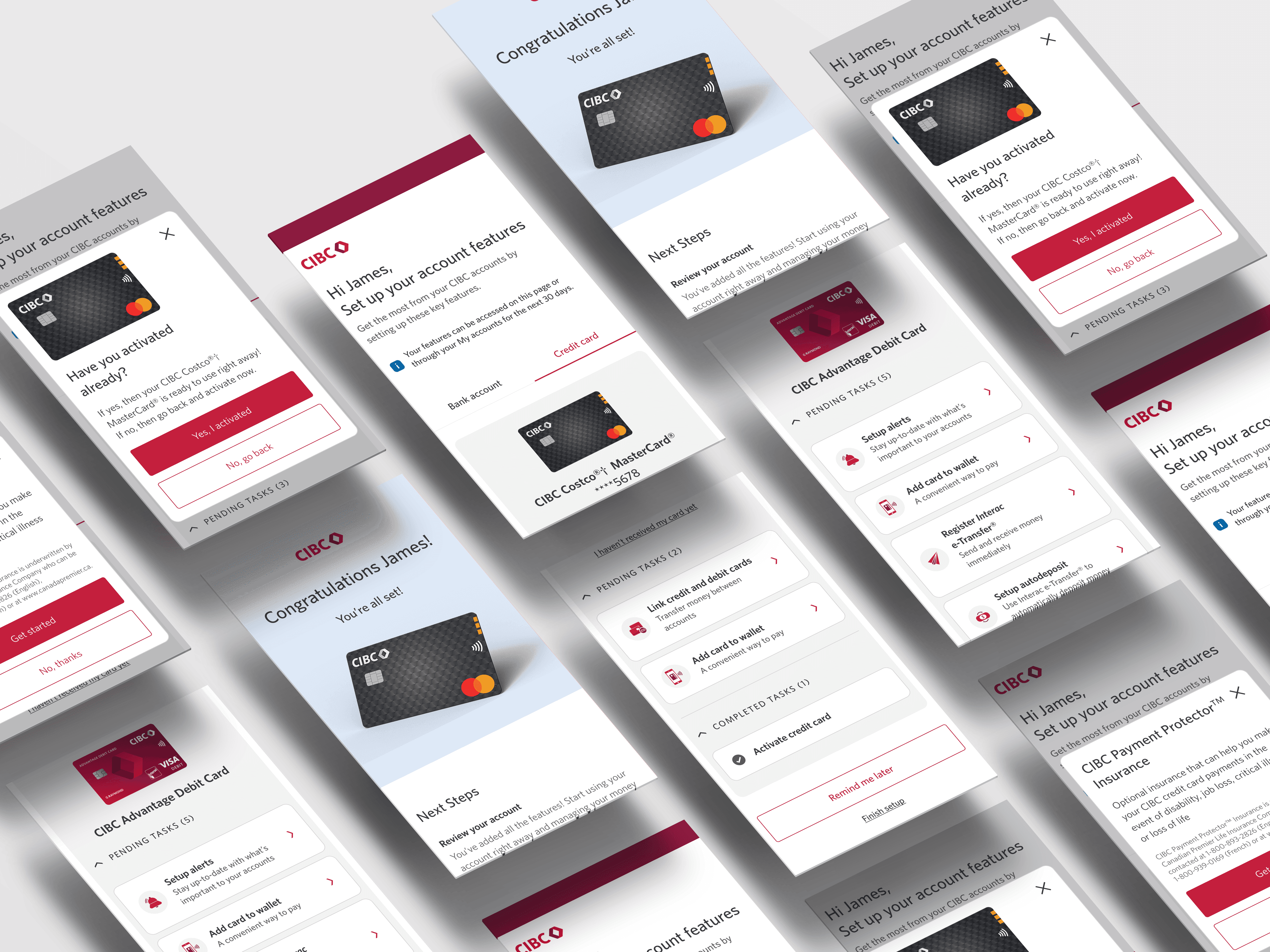
Reference: 2022 CIBC Onboarding Screens
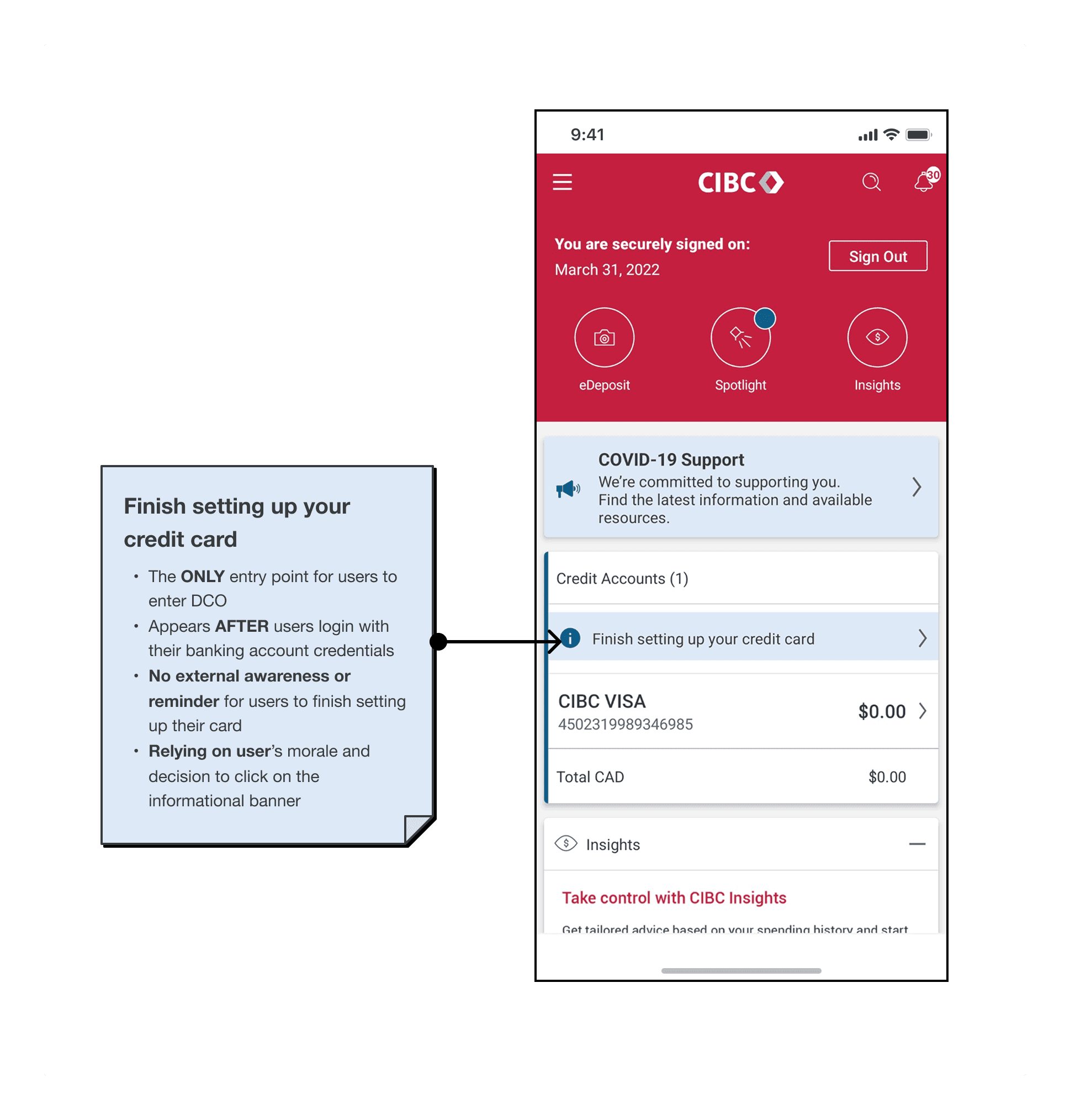
Current State: Entry Point
Right now, the onboarding flow only shows up after users log in with their bank credentials, so it’s the only way they can access DCO. Since there are no external reminders or follow-ups, we’re relying on users to notice and act on a quiet in-app banner—which often leads to drop-off and low setup completion.
Right now, the onboarding flow only shows up after users log in with their bank credentials, so it’s the only way they can access DCO. Since there are no external reminders or follow-ups, we’re relying on users to notice and act on a quiet in-app banner—which often leads to drop-off and low setup completion.
Current State: Landing Page
From decibel heat mapping and Adobe analytics, we uncovered a key behavior pattern:
Clients discovering the entry point
Activating their debit or credit card
Immediately clicking “Remind Me Later” to exit the flow.
Clients were single-task focused — the onboarding flow lacked immediate value beyond that one task.
The progress bar shows a percentage but lacks context and clarity, making it hard for users to understand what’s left and stay motivated to finish.
Weak visual hierarchy and cluttered CTA options make it harder for users to focus, often leading them to delay progress by choosing “remind me later.”

Reference: Journey Mapping & Design Discovery
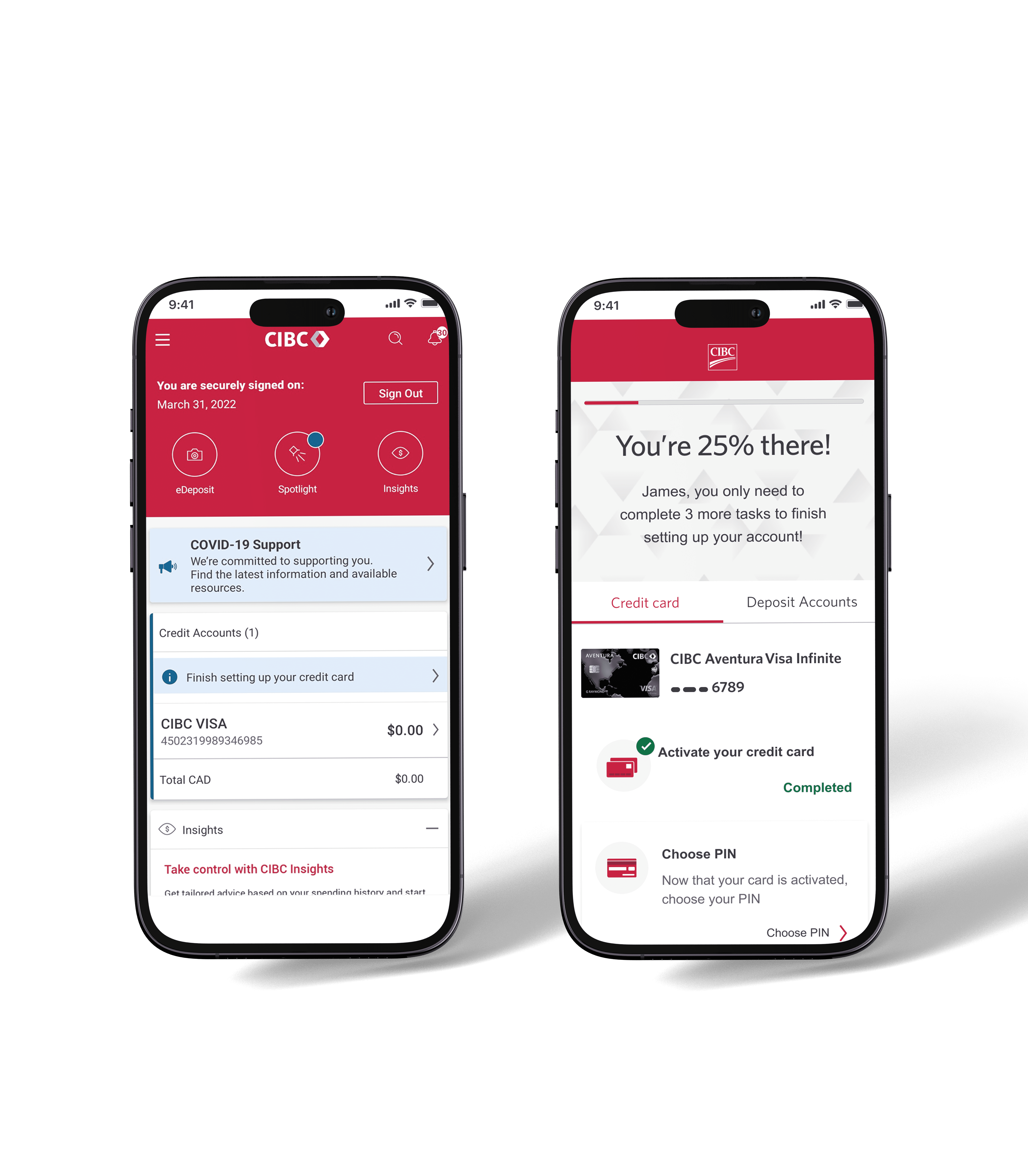
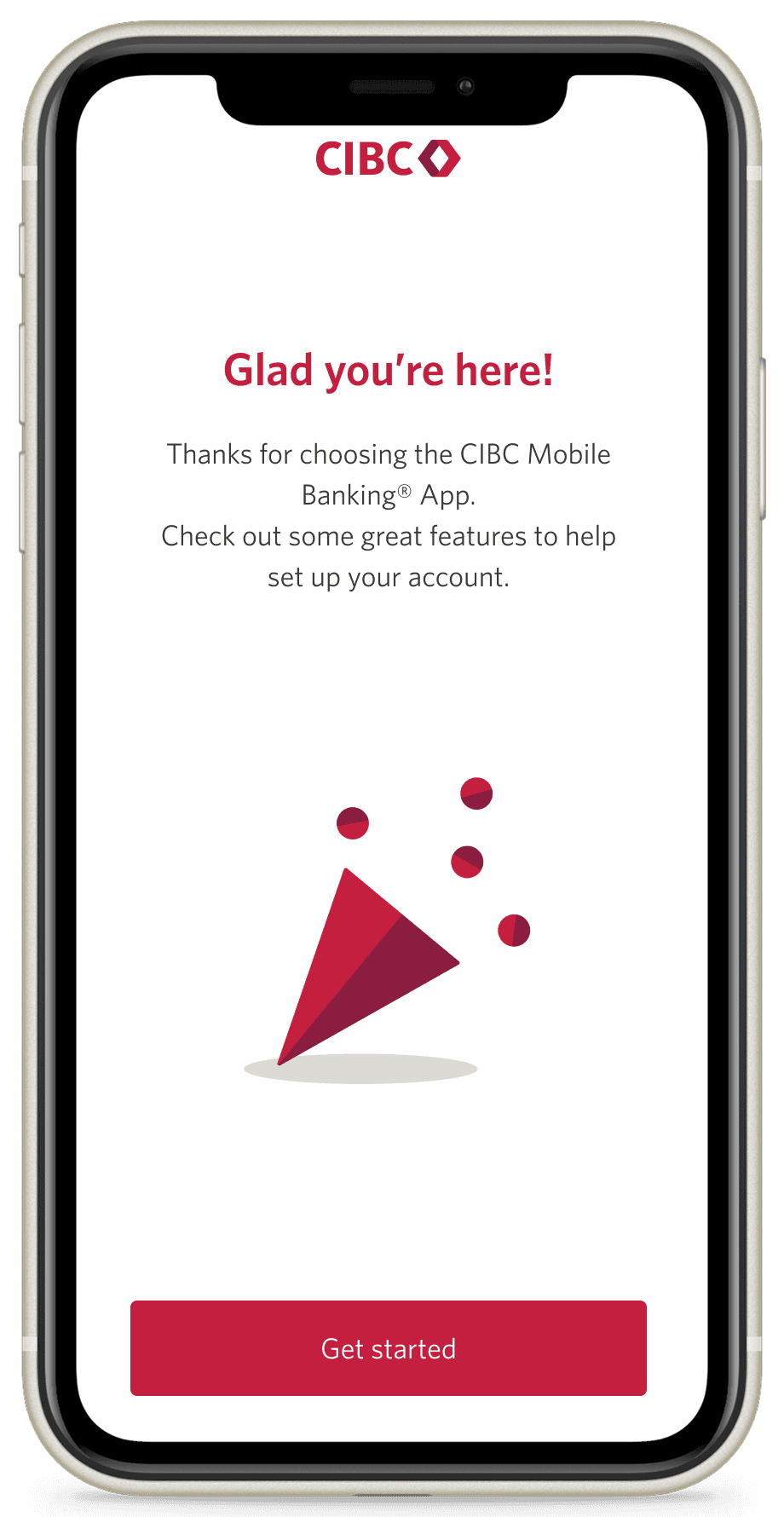
🎉 New State: Onboarding Page
We added a one-time onboarding page that appears the first time to new or returning users log in after their product is approved, giving them a clear starting point to explore DCO.
We added a one-time onboarding page that appears the first time to new or returning users log in after their product is approved, giving them a clear starting point to explore DCO.
🎉 New State: Entry Point
We improved the entry point by moving it from a hidden global banner to a dedicated onboarding section right on the main online banking page. Now, users see it as soon as they log in—right when activating their new product is still fresh on their minds.
We improved the entry point by moving it from a hidden global banner to a dedicated onboarding section right on the main online banking page. Now, users see it as soon as they log in—right when activating their new product is still fresh on their minds.

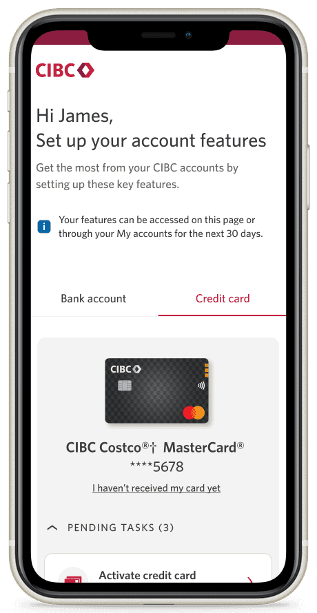
Updated State: Landing Page
We introduced a clear 30-day global banner to gently remind clients of their remaining time, helping reduce drop-off while keeping things transparent. Paired with an expandable task view, the layout now makes better use of space, improves task visibility, and creates a more focused, accessible experience.
We introduced a clear 30-day global banner to gently remind clients of their remaining time, helping reduce drop-off while keeping things transparent. Paired with an expandable task view, the layout now makes better use of space, improves task visibility, and creates a more focused, accessible experience.
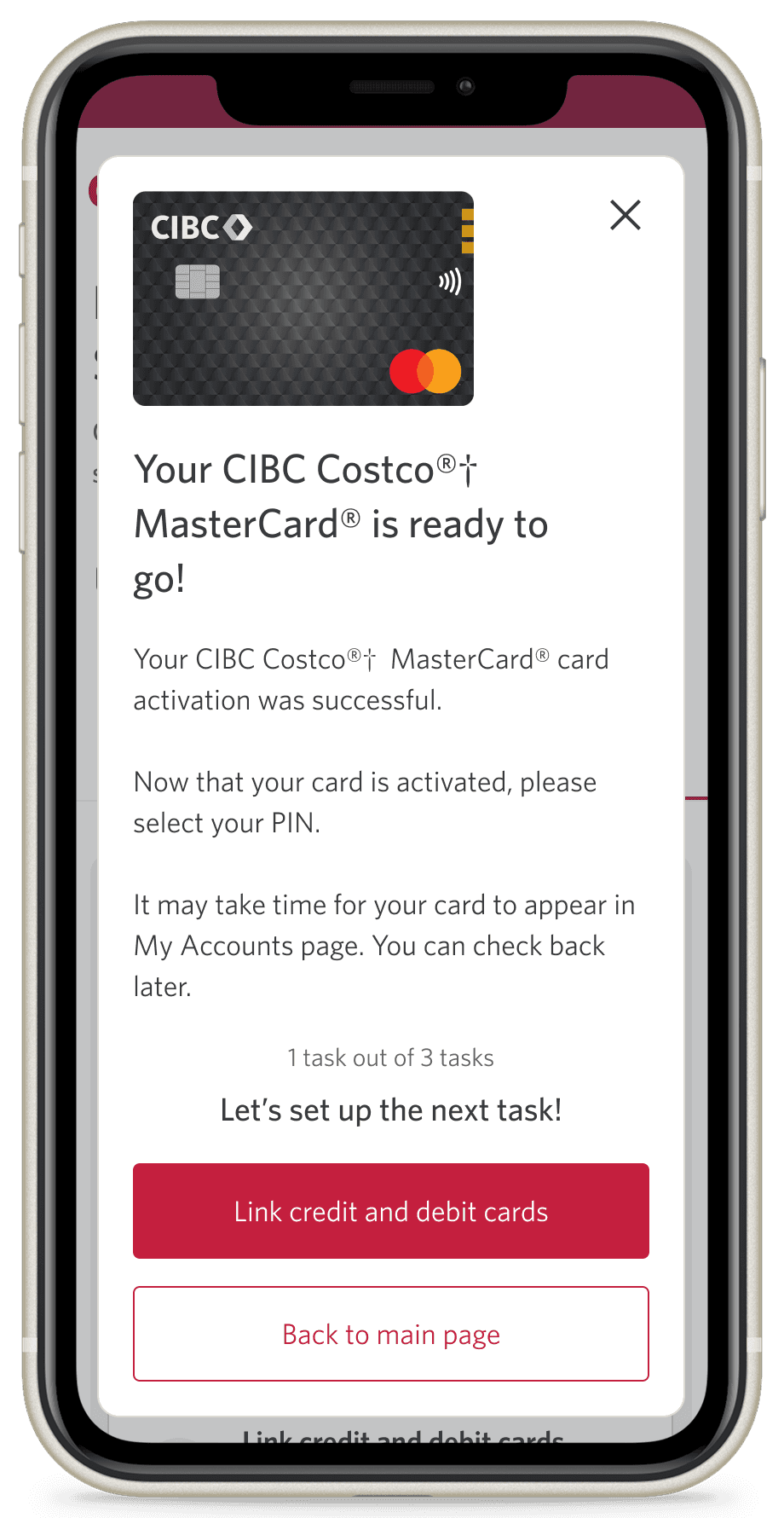
🎉 New State: Confirmation Modal
We improved the entry point by moving it from a hidden global banner to a dedicated onboarding section right on the main online banking page. Now, users see it as soon as they log in—right when activating their new product is still fresh on their minds.
We improved the entry point by moving it from a hidden global banner to a dedicated onboarding section right on the main online banking page. Now, users see it as soon as they log in—right when activating their new product is still fresh on their minds.
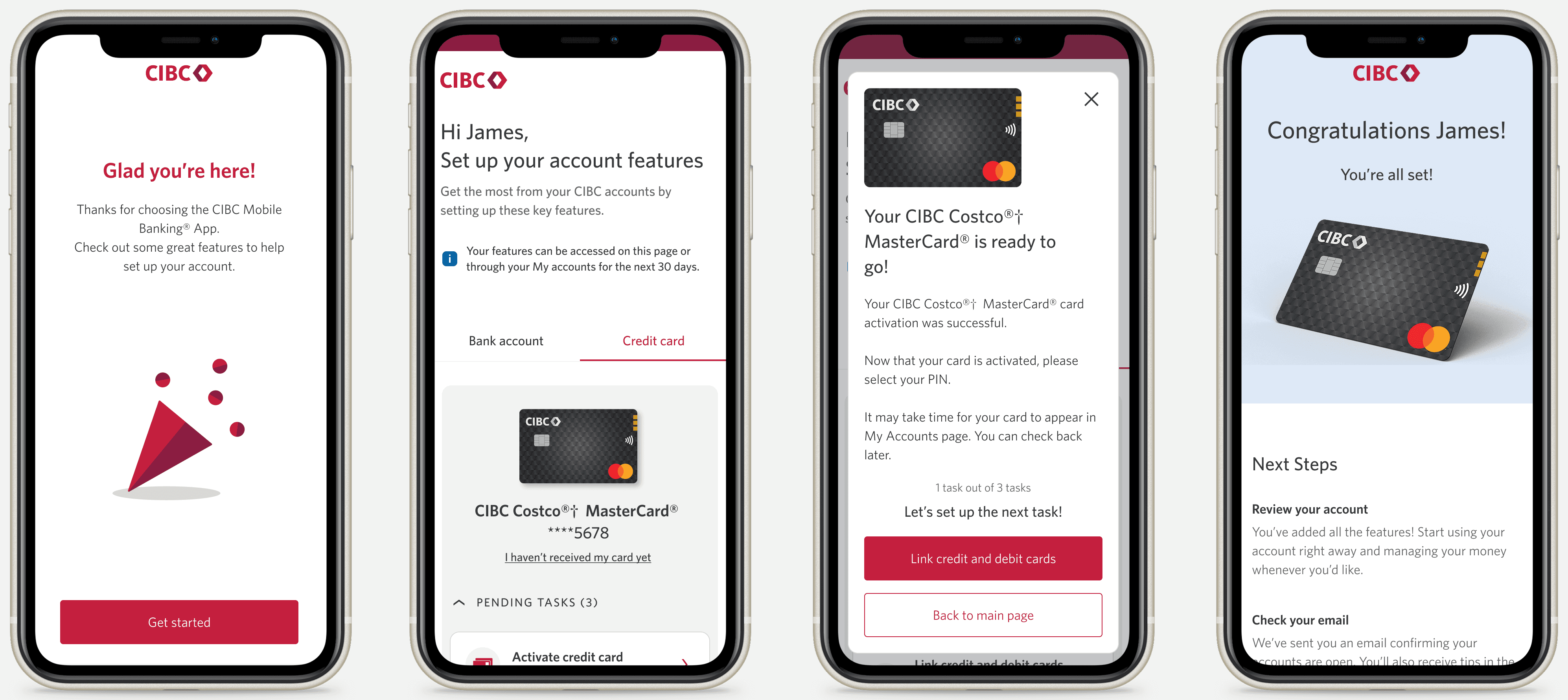
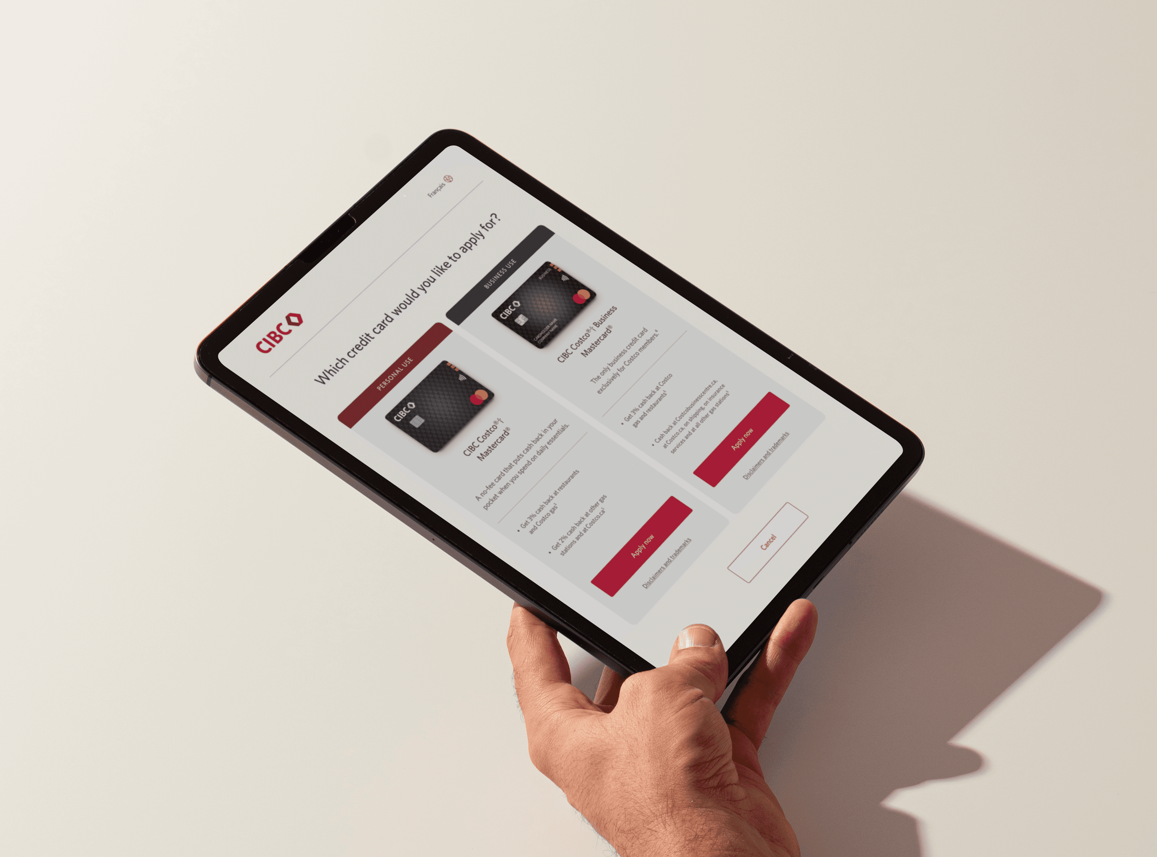
Updated key screens
Initial Launch Results
In 2023, the first phase of the release saw strong results with the new onboarding experience, including a 6% churn rate for clients who engaged with the DCO, compared to 16.8% for those who didn’t.
Additionally, 70% of clients who interacted with the 'fund account' feature added funds, and those who engaged with the DCO in the first 30 days had significantly lower account closure rates.
All Work
UI/UX
Illustrations
Offline


All Work
UI/UX
Illustrations
Offline

Let’s Connect
Let’s
Connect